


Redesigning the Alzheimer's Association Experience
Creating a user-friendly language preference and personalization form to provide clarity and encourage diversity while accessing the non-profit Alzheimer’s Association website.
Role:
UX Designer
Program:
IDEA by Design for America
Timeline:
10 Weeks
Team:
Danny Xu, Anusha Chadalavada, Pranav Ganesan, Nandita Vishwanathan
Tools:
Figma, Figjam, Google Suite
Redesigning the Alzheimer's Association Experience
Redesigning the Alzheimer's Association Experience
Creating a user-friendly language preference and personalization form to provide clarity and encourage diversity while accessing the non-profit Alzheimer’s Association website.
Role: UX Designer
Program: IDEA by Design for America
Timeline: 10 Weeks
Team: Danny Xu, Anusha Chadalavada, Pranav Ganesan, Nandita Vishwanathan
Tools: Figma, Figjam, Google Suite
(This was a student-led project with no real client interaction)
(This was a student-led project with no real client interaction)
THE PROBLEM
THE PROBLEM
THE PROBLEM

Overwhelming Content and Limited Language Diversity is Driving Potential Users Away From the Alzheimer's Association Website.
Due to the loaded information on the website pages of the Alzheimer's Association, many users may feel overwhelmed and less inclined to read. Furthermore, each tab on the menu contains multiple links, and upon clicking, it generates more text-heavy pages to scroll through. Due to this packed website structure, users will not get the answers they are looking for in a straightforward manner, causing them to spend more time on the website than needed. On the other hand, the site has limited language options to choose from despite the country's multilingual population. The exclusive options of English or Spanish may discourage users of other backgrounds from using the site due to its language inaccessibility. These problems led us to solve the following question:
Due to the loaded information on the website pages of the Alzheimer's Association, many users may feel overwhelmed and less inclined to read. Furthermore, each tab on the menu contains multiple links, and upon clicking, it generates more text-heavy pages to scroll through. Due to this packed website structure, users will not get the answers they are looking for in a straightforward manner, causing them to spend more time on the website than needed. On the other hand, the site has limited language options to choose from despite the country's multilingual population. The exclusive options of English or Spanish may discourage users of other backgrounds from using the site due to its language inaccessibility. These problems led us to solve the following question:
How might we create a personalized and inclusive experience for our users?
Overwhelming Content and Limited Language Diversity is Driving Potential Users Away From the Alzheimer's Association Website.
Due to the loaded information on the website pages of the Alzheimer's Association, many users may feel overwhelmed and less inclined to read. Furthermore, each tab on the menu contains multiple links, and upon clicking, it generates more text-heavy pages to scroll through. Due to this packed website structure, users will not get the answers they are looking for in a straightforward manner, causing them to spend more time on the website than needed. On the other hand, the site has limited language options to choose from despite the country's multilingual population. The exclusive options of English or Spanish may discourage users of other backgrounds from using the site due to its language inaccessibility. These problems led us to solve the following question:
How might we create a personalized and inclusive experience for our users?
OUR SOLUTION
OUR SOLUTION
OUR SOLUTION
Building a Website Personalization Feature that Accounts for Language Inclusivity.
Building a Website Personalization Feature that Accounts for Language Inclusivity.
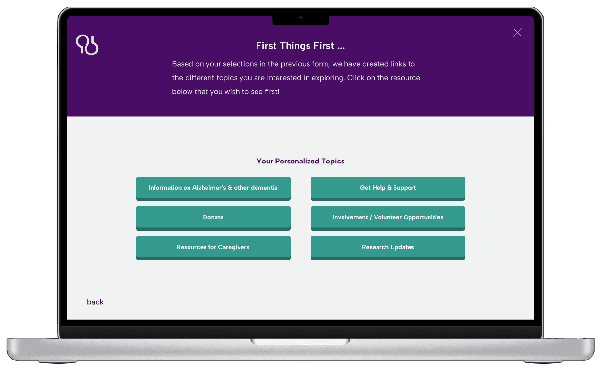

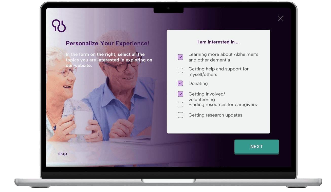
Our team's goal was to make the non-profit Alzheimer's Association website foster an accessible and user-centered experience. To achieve this, we chose to design an optional personalization form that allows users to customize their website experience and choose their preferred language upon initial entry on the site. Our vision was for users to select their language, check the topics they are interested in exploring, and have a customized page of links catered to their choices for a quick, navigable process.
Our team's goal was to make the non-profit Alzheimer's Association website foster an accessible and user-centered experience. To achieve this, we chose to design an optional personalization form that allows users to customize their website experience and choose their preferred language upon initial entry on the site. Our vision was for users to select their language, check the topics they are interested in exploring, and have a customized page of links catered to their choices for a quick, navigable process.
RESEARCH FINDINGS
RESEARCH FINDINGS
RESEARCH FINDINGS
Text-heavy information and overwhelming amount of links causes content overload for users.
The website contains limited language options (Spanish and English), and the preference button is not quickly identifiable.
Cluttered homepage and difficult website navigability interferes with supporting user interests.
Text-heavy information and overwhelming amount of links causes content overload for users.
The website contains limited language options (Spanish and English), and the preference button is not quickly identifiable.
Cluttered homepage and difficult website navigability interferes with supporting user interests.

Top Problems
The website is too crowded with words, links, donation popups
Error prevention, no back buttons. Ex: accidentally inputting a greater amount of money than wanted, no back button to stop it
The live chat is not noticeable as soon as accessing the website (hard for people to get help right away)
Language preference is not consistent throughout the whole website (Spanish integrated in the English)
Recognition over recall: more key words and less paragraphs
Top Problems
Top Problems
The website is too crowded with words, links, donation popups
Error prevention, no back buttons. Ex: accidentally inputting a greater amount of money than wanted, no back button to stop it
The live chat is not noticeable as soon as accessing the website (hard for people to get help right away)
Language preference is not consistent throughout the whole website (Spanish integrated in the English)
Recognition over recall: more key words and less paragraphs
By conducting heuristic evaluations, user-personas, and empathy mapping, our team determined that the underlying issues with the Alzheimer's Association website was its information-heavy layout and lack of inclusiveness. The overwhelming text in the site decreases readability and can make most users less inclined to learn about the content provided. Furthermore, the United States of America is one of the largest multilingual nations in the world, yet the website only considers two language options: English and Spanish. Additionally we found that the majority of those affected by Alzheimer's and other dementia are elderly, with roughly a quarter of them being immigrants from Non-English-speaking countries. This fact led us to prioritize the need for the Alzheimer's Association website to provide a more diverse language preference option for improved user accessibility. Considering language inclusivity and website navigability as our main focus (while keeping the 10-week timeline in mind), our team started brainstorming potential solutions for the two issues at hand.
By conducting heuristic evaluations, user-personas, and empathy mapping, our team determined that the underlying issues with the Alzheimer's Association website was its information-heavy layout and lack of inclusiveness. The overwhelming text in the site decreases readability and can make most users less inclined to learn about the content provided. Furthermore, the United States of America is one of the largest multilingual nations in the world, yet the website only considers two language options: English and Spanish. Additionally we found that the majority of those affected by Alzheimer's and other dementia are elderly, with roughly a quarter of them being immigrants from Non-English-speaking countries. This fact led us to prioritize the need for the Alzheimer's Association website to provide a more diverse language preference option for improved user accessibility. Considering language inclusivity and website navigability as our main focus (while keeping the 10-week timeline in mind), our team started brainstorming potential solutions for the two issues at hand.
IDEATION & WIREFRAMES
IDEATION & WIREFRAMES
IDEATION & WIREFRAMES


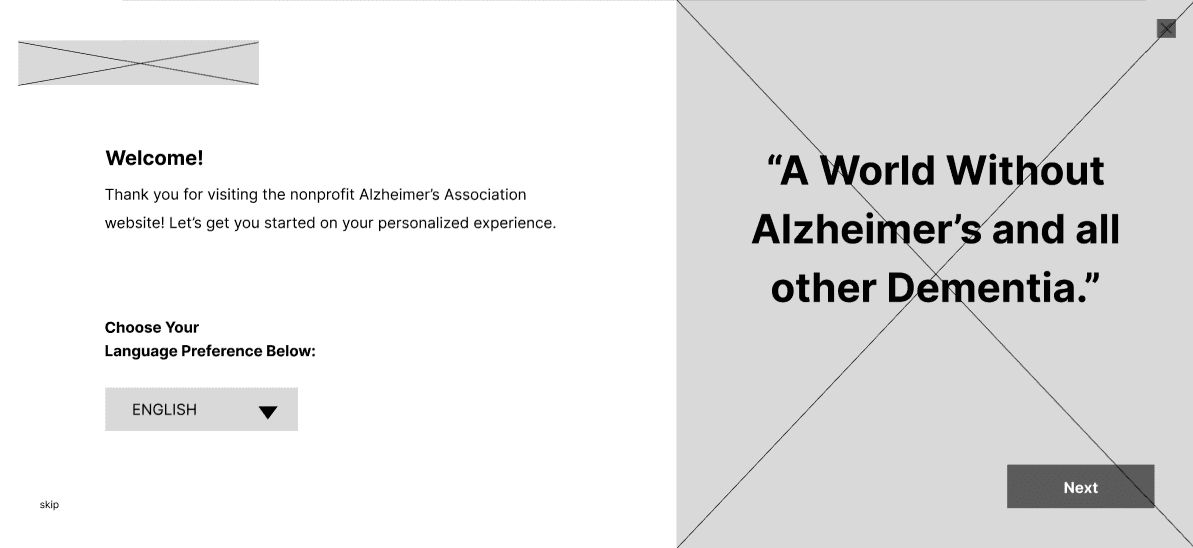
I prioritized simplicity while creating the lo-fidelity wireframes, hoping to guide users around the website with minimal steps involved. As a result, our team decided on designing 3 main frames: an opening language preference page, a personalization checklist, and a page with buttons linked to the user's chosen interests from before. As far as aesthetics goes, I aimed for a functional form and avoided a chaotic layout that could potentially decrease user engagement.
I prioritized simplicity while creating the lo-fidelity wireframes, hoping to guide users around the website with minimal steps involved. As a result, our team decided on designing 3 main frames: an opening language preference page, a personalization checklist, and a page with buttons linked to the user's chosen interests from before. As far as aesthetics goes, I aimed for a functional form and avoided a chaotic layout that could potentially decrease user engagement.

Maintaining Brand Consistency
Maintaining Brand Consistency
Since our main focus was to add to the original website (and not to redesign it), we stuck with the original Alzheimer's Association brand guidelines. Following the original website's style ensured a consistent and seamless integration of our personalization feature. The following style guide is what our team referenced while creating the high-fidelity designs.
Since our main focus was to add to the original website (and not to redesign it), we stuck with the original Alzheimer's Association brand guidelines. Following the original website's style ensured a consistent and seamless integration of our personalization feature. The following style guide is what our team referenced while creating the high-fidelity designs.
THE RESULTS
THE RESULTS
THE RESULTS


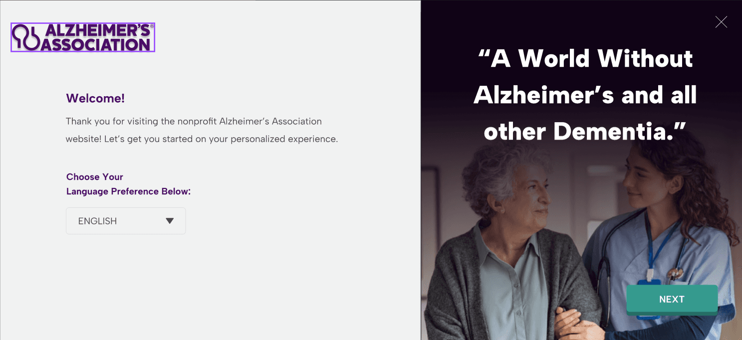


Choose from a prominent language button with various options for selection.
Choose from a prominent language button with various options for selection.
Choose from a prominent language button with various options for selection.
Upon initial access of the website, you will be prompted to select a language of your choosing. After exiting the form, the language button can be accessed again on the top right.
Upon initial access of the website, you will be prompted to select a language of your choosing. After exiting the form, the language button can be accessed again on the top right.
Upon initial access of the website, you will be prompted to select a language of your choosing. After exiting the form, the language button can be accessed again on the top right.
Gain a customizable experience involving minimal steps.
Gain a customizable experience involving minimal steps.
Gain a customizable experience involving minimal steps.
In just two steps, you will have a personalized page ready to explore! Simply select the options of interest, and the form will generate buttons linked to those selections on the next page.
In just two steps, you will have a personalized page ready to explore! Simply select the options of interest, and the form will generate buttons linked to those selections on the next page.
In just two steps, you will have a personalized page ready to explore! Simply select the options of interest, and the form will generate buttons linked to those selections on the next page.
Easy access to your personalized choices in just a click of a button.
Easy access to your personalized choices in just a click of a button.
Easy access to your personalized choices in just a click of a button.
After filling out the form, you can re-access your personalized page by clicking the button located on the bottom left of your homepage.
After filling out the form, you can re-access your personalized page by clicking the button located on the bottom left of your homepage.
After filling out the form, you can re-access your personalized page by clicking the button located on the bottom left of your homepage.
JUSTIFYING OUR CHOICES
JUSTIFYING OUR CHOICES
JUSTIFYING OUR CHOICES


Before:
After:
Before our changes, the Alzheimer's Association website contained an unnoticeable language preference button. Due to its small scale, the button could not be easily accessed, especially by elderly users with troubled vision. Therefore, we redesigned the homepage to contain a more prominent button right next to the Donation one, removing other unnecessary links and buttons to maintain a minimal website appearance. In regards to the language options, our team hoped to expand website accessibility to Non-English speaking users beyond Spanish speakers. So, we added four more languages (most commonly spoken in America) in our new language preference button to increase the non-profit's user diversity.
Why Choose to Create a Personalization Form Instead of a Website Redesign?
Why Choose to Create a Personalization Form Instead of a Website Redesign?
Our team decided to build a personalization feature to integrate into the website because it was a unique direction for us to explore. Although we could have taken the typical route of performing a website redesign like the other teams, we wanted to test our creativity and brainstorm a novel solution that can still effectively combat our problem. Furthermore, designing a customizable form was the optimal decision for our timeline. Had we stuck with redesigning the website, many parts would have remained incomplete. Therefore, we made the choice of doing something of a smaller scale as it would result in displaying our best potential as designers.
Our team decided to build a personalization feature to integrate into the website because it was a unique direction for us to explore. Although we could have taken the typical route of performing a website redesign like the other teams, we wanted to test our creativity and brainstorm a novel solution that can still effectively combat our problem. Furthermore, designing a customizable form was the optimal decision for our timeline. Had we stuck with redesigning the website, many parts would have remained incomplete. Therefore, we made the choice of doing something of a smaller scale as it would result in displaying our best potential as designers.
Before:
After:
Before our changes, the Alzheimer's Association website contained an unnoticeable language preference button. Due to its small scale, the button could not be easily accessed, especially by elderly users with troubled vision. Therefore, we redesigned the homepage to contain a more prominent button right next to the Donation one, removing other unnecessary links and buttons to maintain a minimal website appearance. In regards to the language options, our team hoped to expand website accessibility to Non-English speaking users beyond Spanish speakers. So, we added four more languages (most commonly spoken in America) in our new language preference button to increase the non-profit's user diversity.
REFLECTION
REFLECTION
REFLECTION
1
There is Always Room for Improvement.
There is Always Room for Improvement.
Initially, my team and I found it difficult to find problems with the Alzheimer's Association website. Nothing major seemed to stand out to us at first glance, and we were lost as to how we can improve a site that already seemed 'perfect'. However, working through the research process helped us see the flaws we couldn't find before. It taught us the important of performing thorough research. Nothing is ever perfect; we just needed to look a little closer to identify the hidden issue.
Initially, my team and I found it difficult to find problems with the Alzheimer's Association website. Nothing major seemed to stand out to us at first glance, and we were lost as to how we can improve a site that already seemed 'perfect'. However, working through the research process helped us see the flaws we couldn't find before. It taught us the important of performing thorough research. Nothing is ever perfect; we just needed to look a little closer to identify the hidden issue.
2
Even the Simplest Solution Can Be Impactful.
Even the Simplest Solution Can Be Impactful.
Since our team decided to design a personalization feature instead of performing a website redesign, I doubted the strength of the solution and thought it might be too basic to be effective. But as the results started coming together, I found that our choice was a good one. Although our solution was of a smaller scale, it didn't equate to zero contribution. This project helped me understand as a designer that even the most minor detail can have a strong impact.
Since our team decided to design a personalization feature instead of performing a website redesign, I doubted the strength of the solution and thought it might be too basic to be effective. But as the results started coming together, I found that our choice was a good one. Although our solution was of a smaller scale, it didn't equate to zero contribution. This project helped me understand as a designer that even the most minor detail can have a strong impact.
3
The Best Way to Learn is by Doing.
The Best Way to Learn is by Doing.
Before participating in this program, I had no prior knowledge of UX design. I often worried I wouldn't learn enough to meet this field's expectations. Despite my worries, I realized that working on this project taught me more than I expected. I conducted my own research, identified user pain-points, and developed my problem-solving skills. Overall, I found that it's okay to step into an opportunity not fully knowing everything, as you will naturally gain the skills you need through the experience.
Before participating in this program, I had no prior knowledge of UX design. I often worried I wouldn't learn enough to meet this field's expectations. Despite my worries, I realized that working on this project taught me more than I expected. I conducted my own research, identified user pain-points, and developed my problem-solving skills. Overall, I found that it's okay to step into an opportunity not fully knowing everything, as you will naturally gain the skills you need through the experience.
What would I do differently if I had the chance?
What would I do differently if I had the chance?
Focus on creating a responsive design that is compatible with various screens. The current product is not compatible with other desktop sizes, along with tablets and phones. Responsiveness is an important quality to have for a website, especially for a large non-profit like the Alzheimer's Association.
Prioritize fitting user-testing into the design timeline. Since this was a 10-week beginner program, we were not required to perform user-testing of our final products. However, testing our solution is a major step in evaluating the effectiveness of our design and can help us identify issues with our product that we might have missed initially.
Build stronger prototype interactions for the form. Currently, the prototype is made to mimic the effect of a proper customizable interaction between the second and third pages of the personalization form due to my limited skills in Figma prototyping. I hope to make a seamless transition between those two pages, where the third frame responds and is customized accurately based on the selections in the second frame.
Focus on creating a responsive design that is compatible with various screens. The current product is not compatible with other desktop sizes, along with tablets and phones. Responsiveness is an important quality to have for a website, especially for a large non-profit like the Alzheimer's Association.
Prioritize fitting user-testing into the design timeline. Since this was a 10-week beginner program, we were not required to perform user-testing of our final products. However, testing our solution is a major step in evaluating the effectiveness of our design and can help us identify issues with our product that we might have missed initially.
Build stronger prototype interactions for the form. Currently, the prototype is made to mimic the effect of a proper customizable interaction between the second and third pages of the personalization form due to my limited skills in Figma prototyping. I hope to make a seamless transition between those two pages, where the third frame responds and is customized accurately based on the selections in the second frame.
Thank You for Reading!
Check out my other projects, as well!
Thank You for Reading!
Check out my other projects, as well!
Thank You for Reading!
Check out my other projects, as well!
X
celerator
U

BACK TO TOP
BACK TO TOP

